Allen Micah, Poggiali Davide, Whitaker Kirstie, Marshall Tom Rhys, van Langen Jordy, Kievit Rogier A
Aarhus Institute of Advanced Studies, Aarhus University, Aarhus, Denmark.
Department of Psychiatry, University of Cambridge, Cambridge, UK.
Wellcome Open Res. 2021 Jan 21;4:63. doi: 10.12688/wellcomeopenres.15191.2. eCollection 2019.
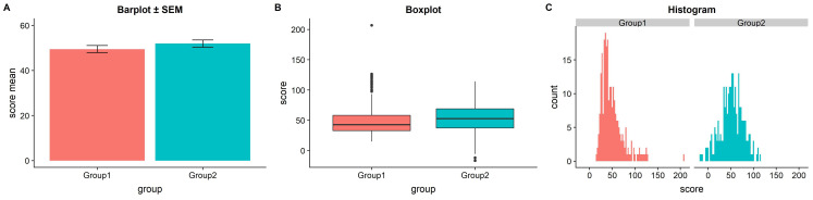
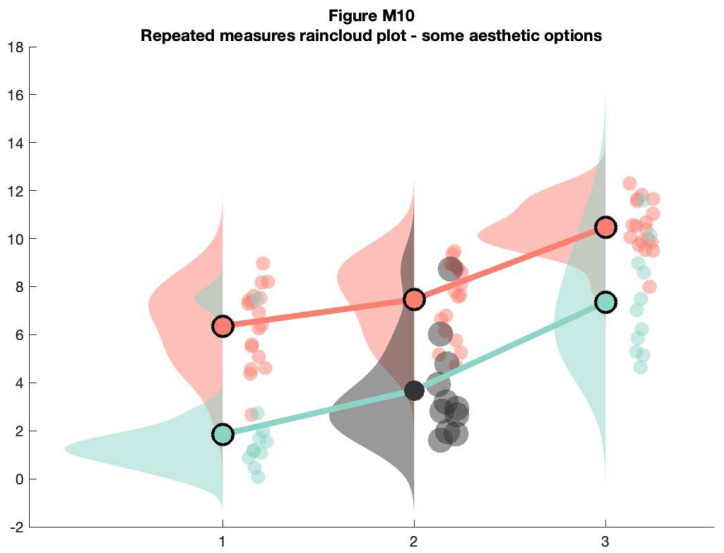
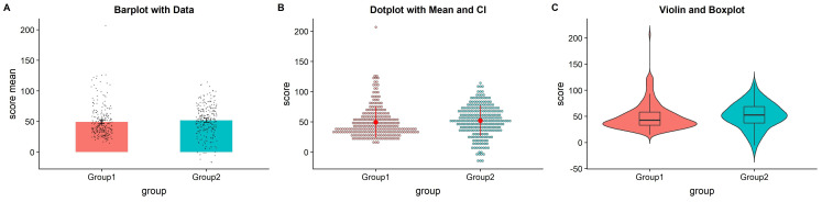
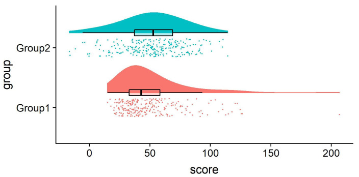
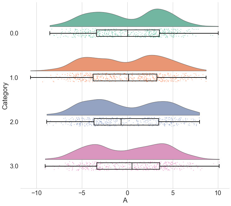
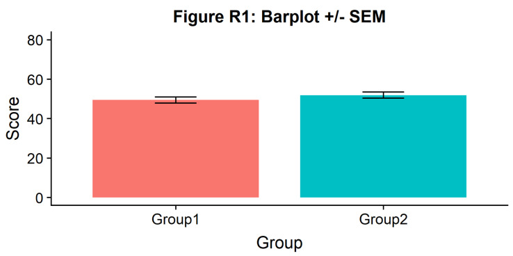
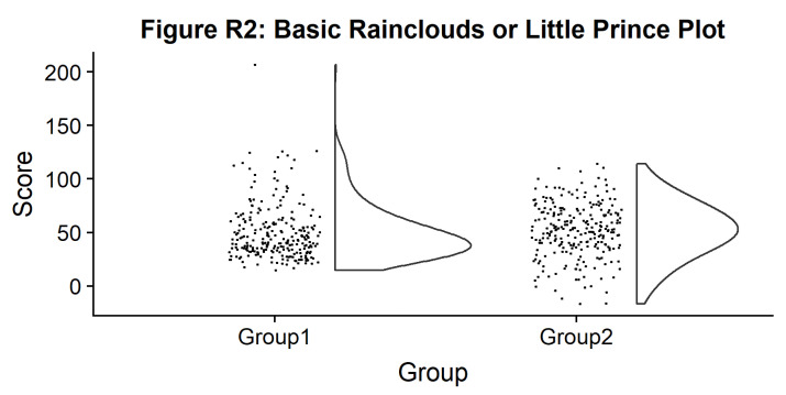
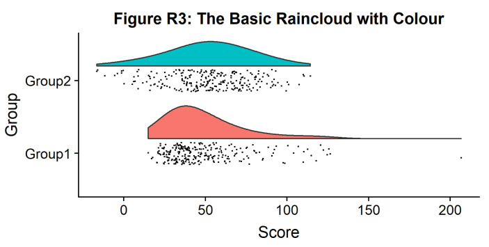
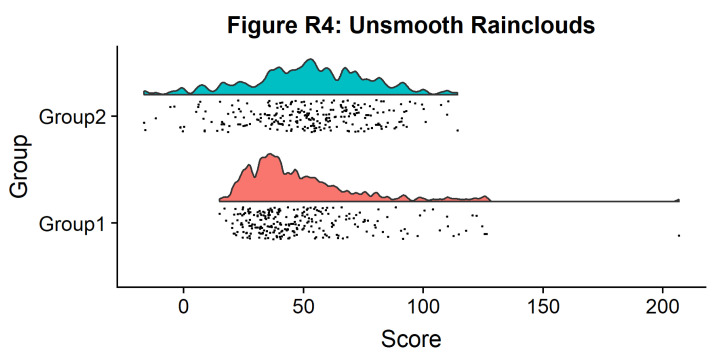
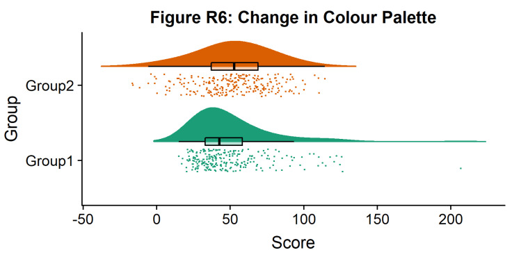
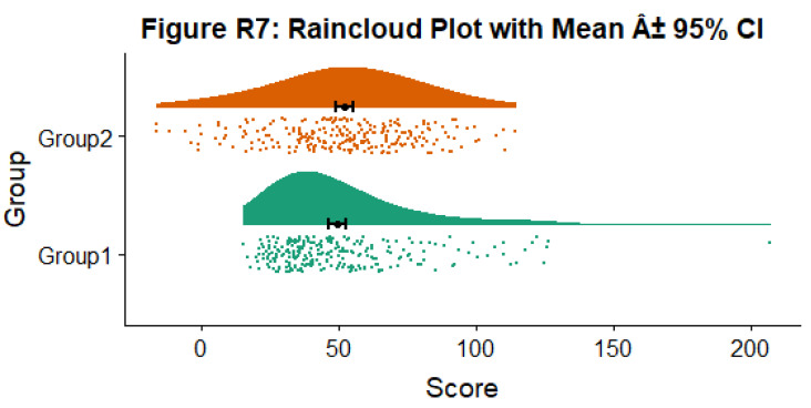
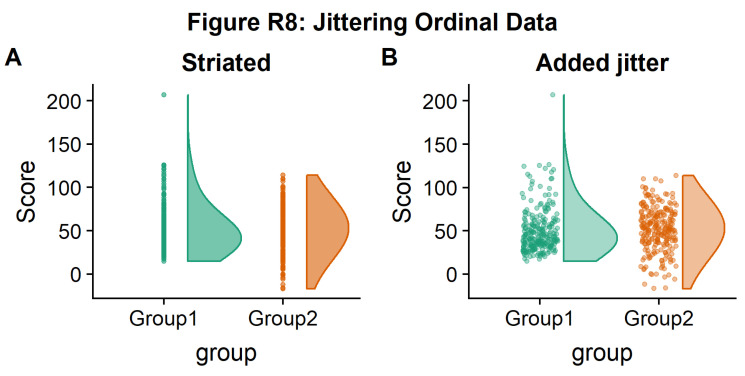
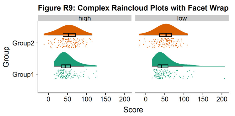
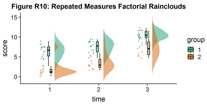
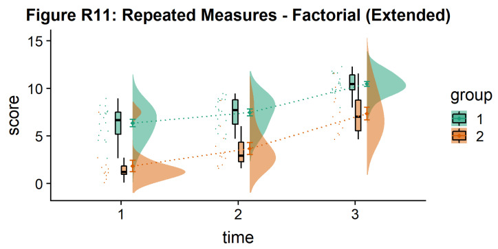
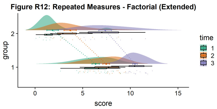
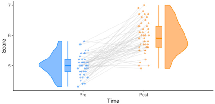
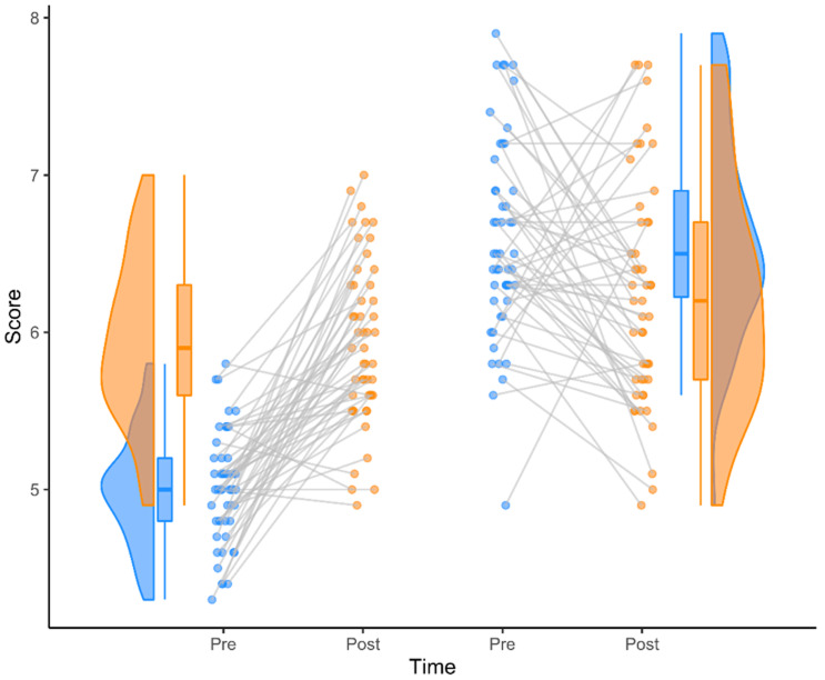
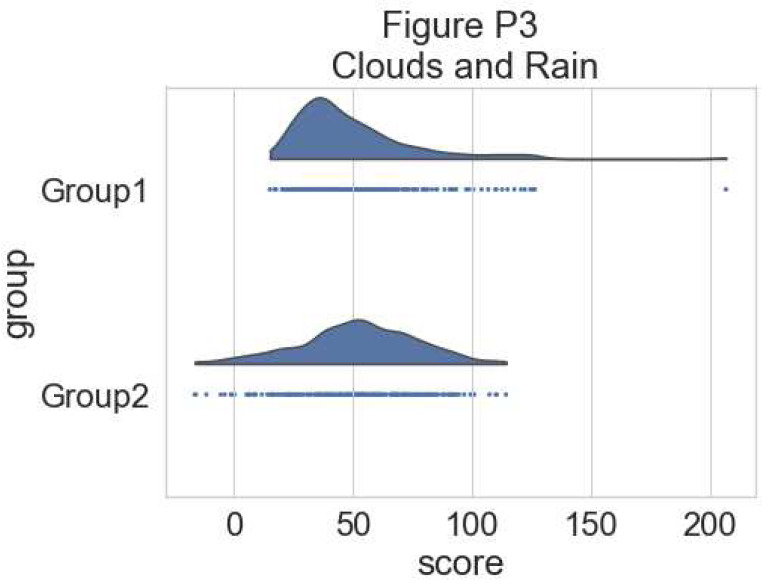
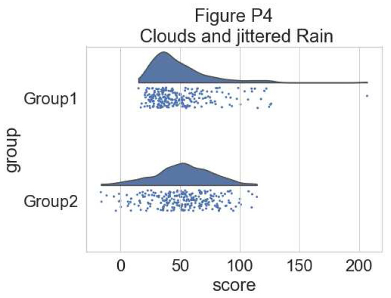
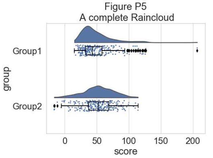
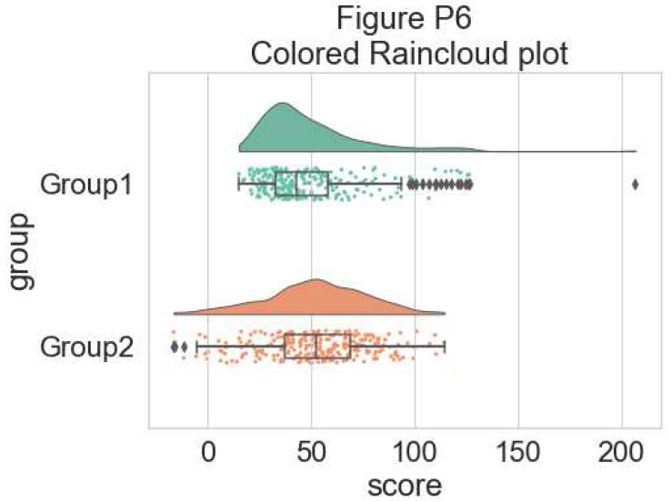
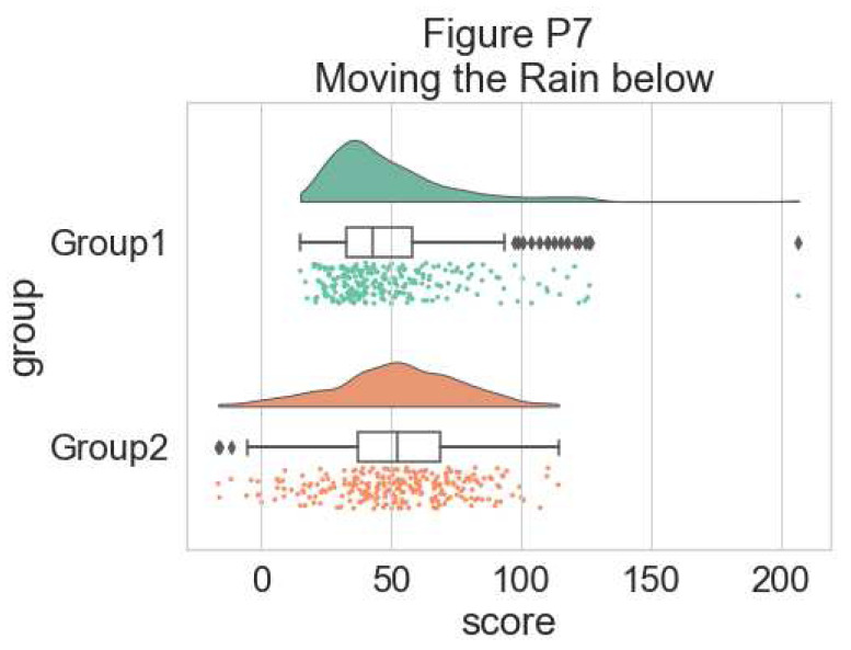
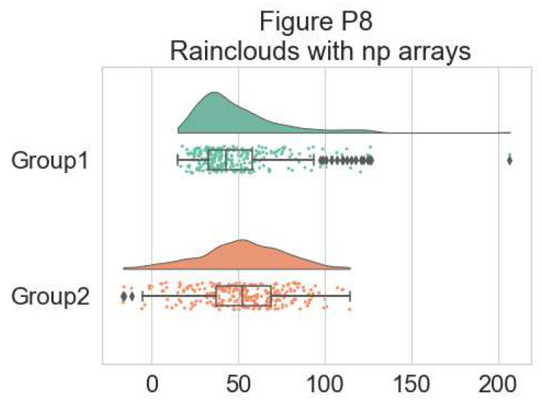
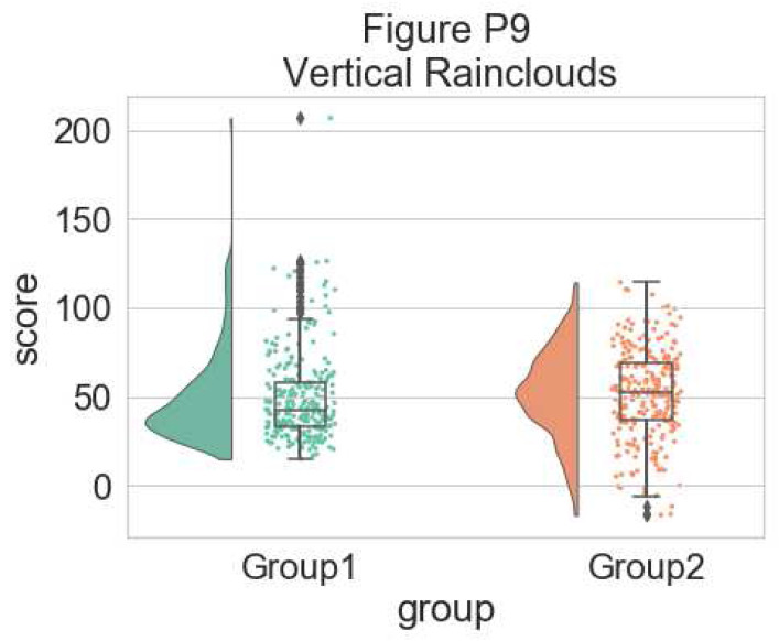
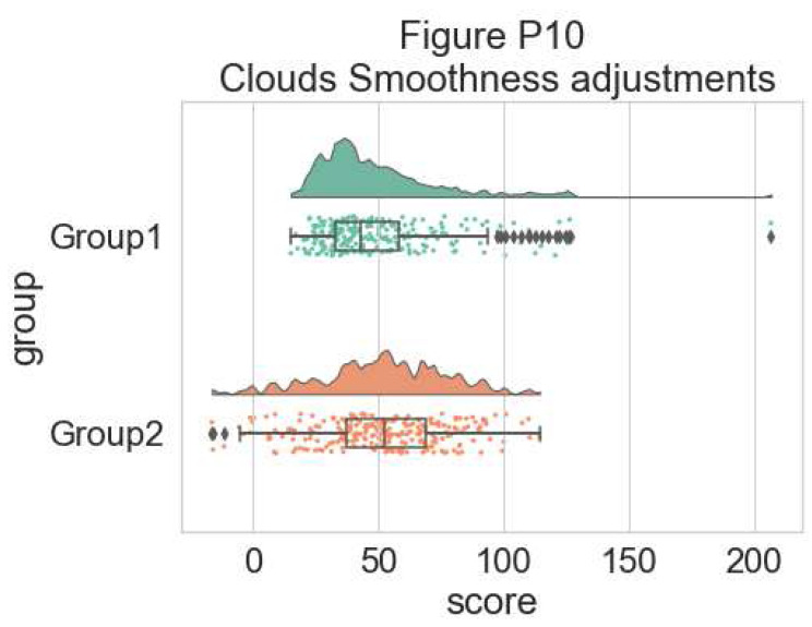
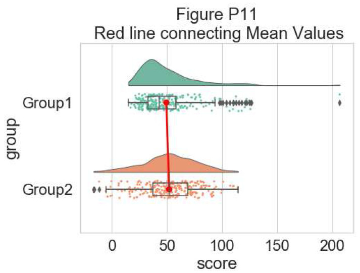
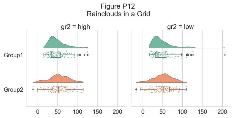
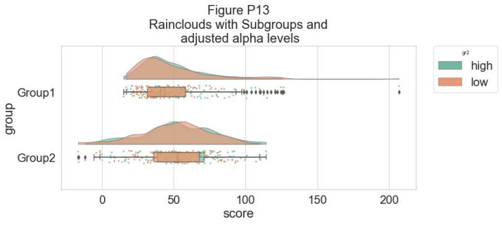
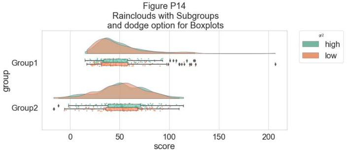
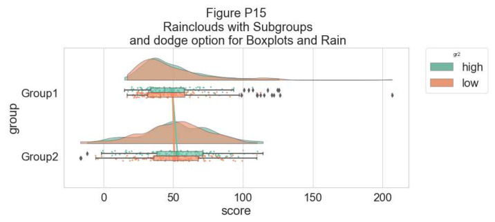
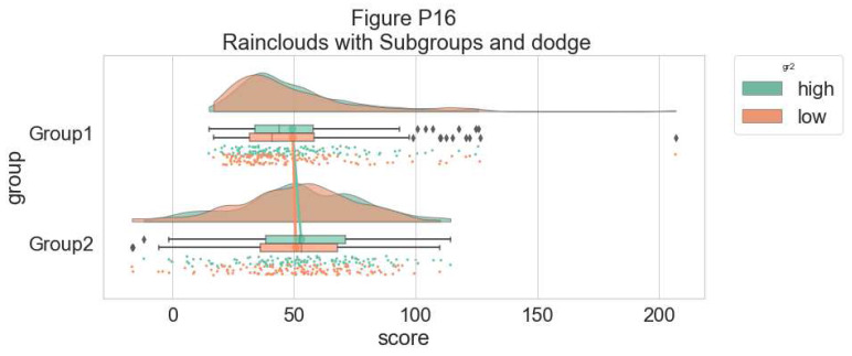
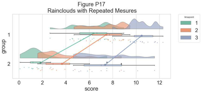
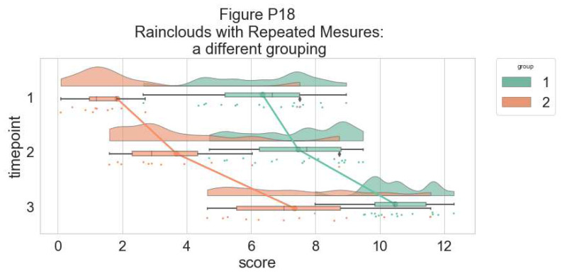
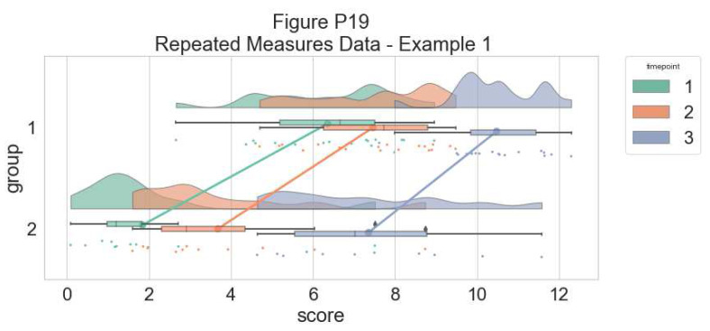
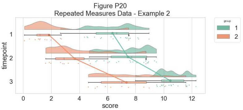
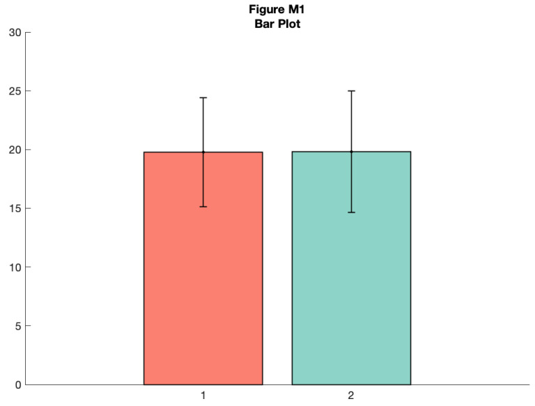
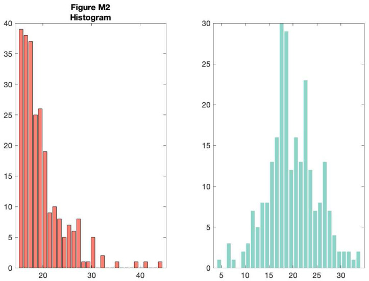
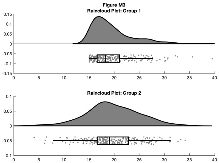
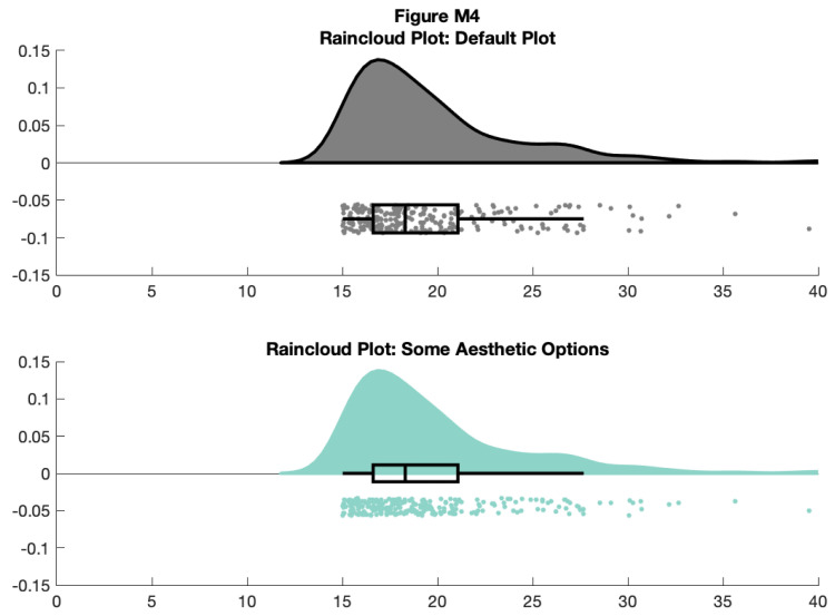
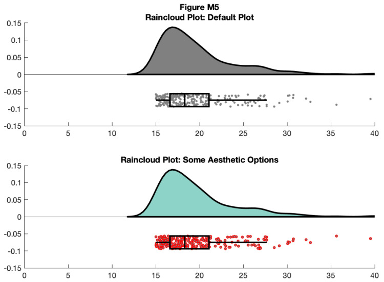
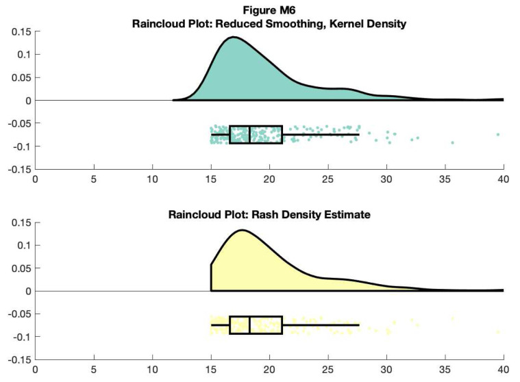
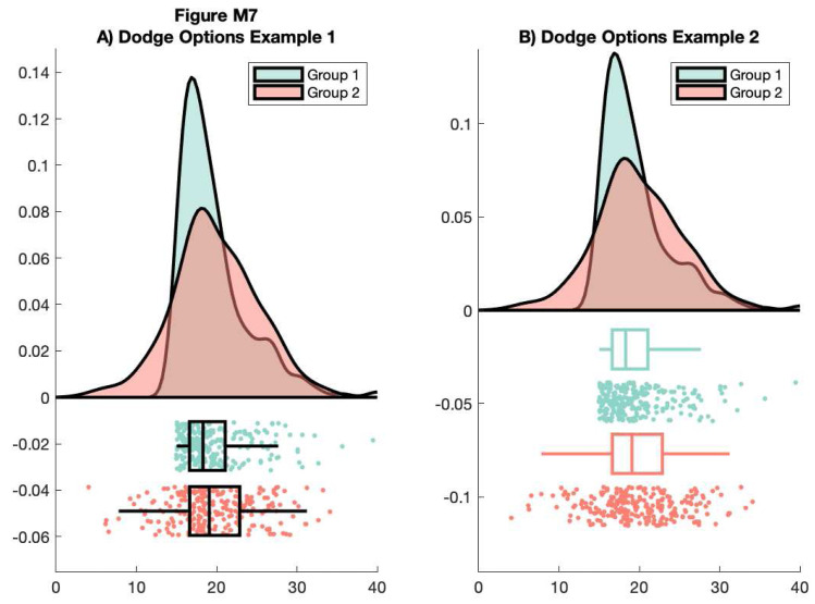
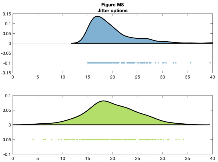
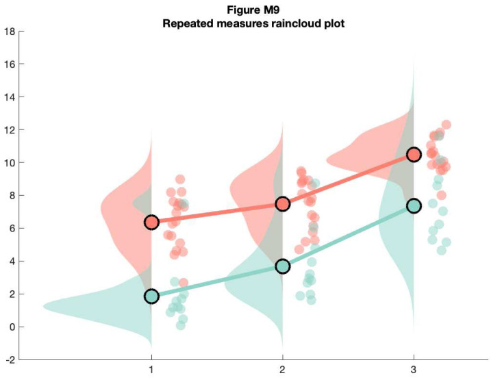
Across scientific disciplines, there is a rapidly growing recognition of the need for more statistically robust, transparent approaches to data visualization. Complementary to this, many scientists have called for plotting tools that accurately and transparently convey key aspects of statistical effects and raw data with minimal distortion. Previously common approaches, such as plotting conditional mean or median barplots together with error-bars have been criticized for distorting effect size, hiding underlying patterns in the raw data, and obscuring the assumptions upon which the most commonly used statistical tests are based. Here we describe a data visualization approach which overcomes these issues, providing maximal statistical information while preserving the desired 'inference at a glance' nature of barplots and other similar visualization devices. These "raincloud plots" can visualize raw data, probability density, and key summary statistics such as median, mean, and relevant confidence intervals in an appealing and flexible format with minimal redundancy. In this tutorial paper, we provide basic demonstrations of the strength of raincloud plots and similar approaches, outline potential modifications for their optimal use, and provide open-source code for their streamlined implementation in R, Python and Matlab ( https://github.com/RainCloudPlots/RainCloudPlots). Readers can investigate the R and Python tutorials interactively in the browser using Binder by Project Jupyter.
在各个科学学科中,人们越来越迅速地认识到需要采用统计上更稳健、更透明的数据可视化方法。与此相辅相成的是,许多科学家呼吁绘图工具能够以最小的失真准确、透明地传达统计效应和原始数据的关键方面。以前常见的方法,如绘制条件均值或中位数柱状图并加上误差线,因扭曲效应大小、隐藏原始数据中的潜在模式以及模糊最常用统计检验所基于的假设而受到批评。在此,我们描述一种数据可视化方法,该方法克服了这些问题,在保留柱状图和其他类似可视化工具所需的“一目了然的推断”特性的同时,提供最大的统计信息。这些“雨云图”能够以一种吸引人且灵活的格式可视化原始数据、概率密度以及关键汇总统计量,如中位数、均值和相关置信区间,且冗余最小。在这篇教程论文中,我们展示了雨云图及类似方法的优势,概述了为实现其最佳使用的潜在修改,并提供了在R、Python和Matlab中简化实现的开源代码(https://github.com/RainCloudPlots/RainCloudPlots)。读者可以使用Project Jupyter的Binder在浏览器中交互式地研究R和Python教程。