Weissgerber Tracey L, Savic Marko, Winham Stacey J, Stanisavljevic Dejana, Garovic Vesna D, Milic Natasa M
From the Division of Nephrology and Hypertension and
the Department of Medical Statistics and Informatics, Medical Faculty, University of Belgrade, Belgrade 11000, Serbia.
J Biol Chem. 2017 Dec 15;292(50):20592-20598. doi: 10.1074/jbc.RA117.000147. Epub 2017 Oct 3.
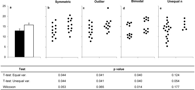
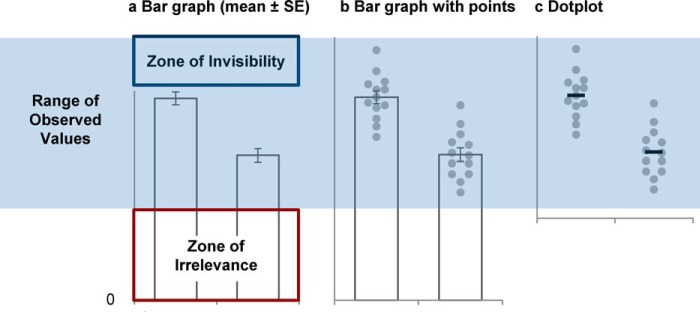
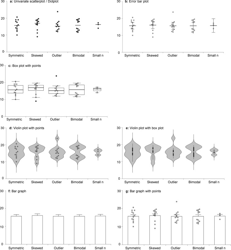
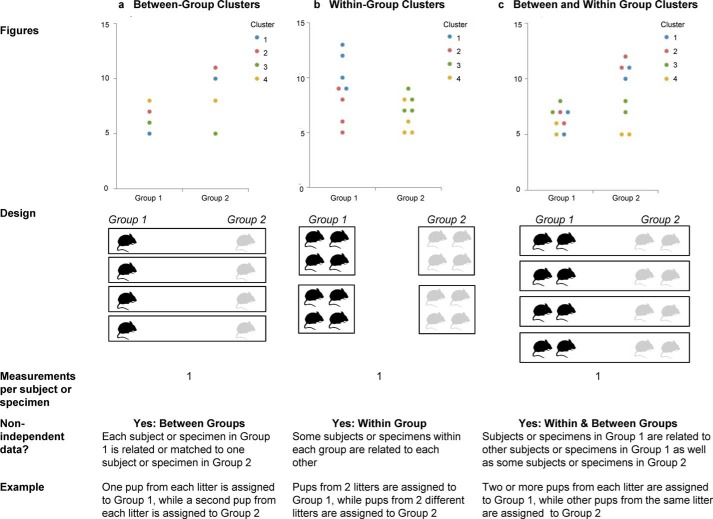
Although bar graphs are designed for categorical data, they are routinely used to present continuous data in studies that have small sample sizes. This presentation is problematic, as many data distributions can lead to the same bar graph, and the actual data may suggest different conclusions from the summary statistics. To address this problem, many journals have implemented new policies that require authors to show the data distribution. This paper introduces a free, web-based tool for creating an interactive alternative to the bar graph (http://statistika.mfub.bg.ac.rs/interactive-dotplot/). This tool allows authors with no programming expertise to create customized interactive graphics, including univariate scatterplots, box plots, and violin plots, for comparing values of a continuous variable across different study groups. Individual data points may be overlaid on the graphs. Additional features facilitate visualization of subgroups or clusters of non-independent data. A second tool enables authors to create interactive graphics from data obtained with repeated independent experiments (http://statistika.mfub.bg.ac.rs/interactive-repeated-experiments-dotplot/). These tools are designed to encourage exploration and critical evaluation of the data behind the summary statistics and may be valuable for promoting transparency, reproducibility, and open science in basic biomedical research.
尽管柱状图是为分类数据设计的,但在样本量较小的研究中,它们经常被用来呈现连续数据。这种呈现方式存在问题,因为许多数据分布可能导致相同的柱状图,而且实际数据可能会得出与汇总统计数据不同的结论。为了解决这个问题,许多期刊已经实施了新政策,要求作者展示数据分布。本文介绍了一种免费的基于网络的工具,用于创建柱状图的交互式替代图形(http://statistika.mfub.bg.ac.rs/interactive-dotplot/)。该工具使没有编程专业知识的作者能够创建定制的交互式图形,包括单变量散点图、箱线图和小提琴图,用于比较不同研究组中连续变量的值。各个数据点可以叠加在图形上。其他功能有助于可视化非独立数据的亚组或聚类。第二个工具使作者能够根据重复独立实验获得的数据创建交互式图形(http://statistika.mfub.bg.ac.rs/interactive-repeated-experiments-dotplot/)。这些工具旨在鼓励对汇总统计数据背后的数据进行探索和批判性评估,对于促进基础生物医学研究中的透明度、可重复性和开放科学可能具有重要价值。