Chiang Sharon, Moss Robert, Black Angela P, Jackson Michele, Moss Chuck, Bidwell Jonathan, Meisel Christian, Loddenkemper Tobias
Department of Neurology and Weill Institute for Neurosciences, University of California, San Francisco, San Francisco, California, USA.
Seizure Tracker, LLC, Springfield, Virginia, USA.
JAMIA Open. 2021 Mar 1;4(1):ooab009. doi: 10.1093/jamiaopen/ooab009. eCollection 2021 Jan.
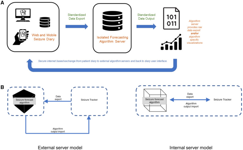
Seizure forecasting algorithms have become increasingly accurate and may reduce the morbidity and mortality caused by seizure unpredictability. Translating these benefits into meaningful health outcomes for people with epilepsy requires effective data visualization of algorithm outputs. To date, no studies have investigated patient and physician perspectives on effective translation of algorithm outputs into data visualizations through health information technology.
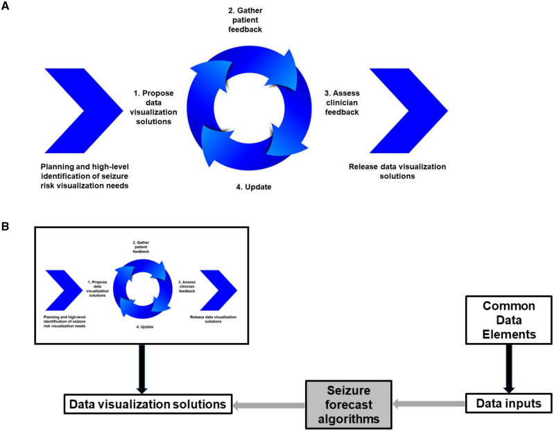
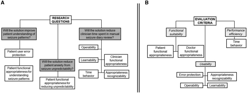
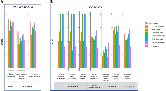
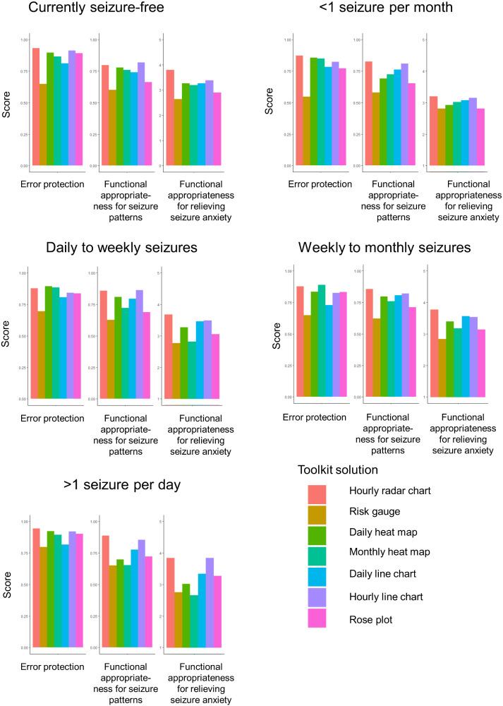
We developed front-end data visualizations as part of a Seizure Forecast Visualization Toolkit. We surveyed 627 people living with epilepsy and caregivers, and 28 epilepsy healthcare providers. Respondents scored each visualization in terms of international standardized software quality criteria for functionality, appropriateness, and usability.
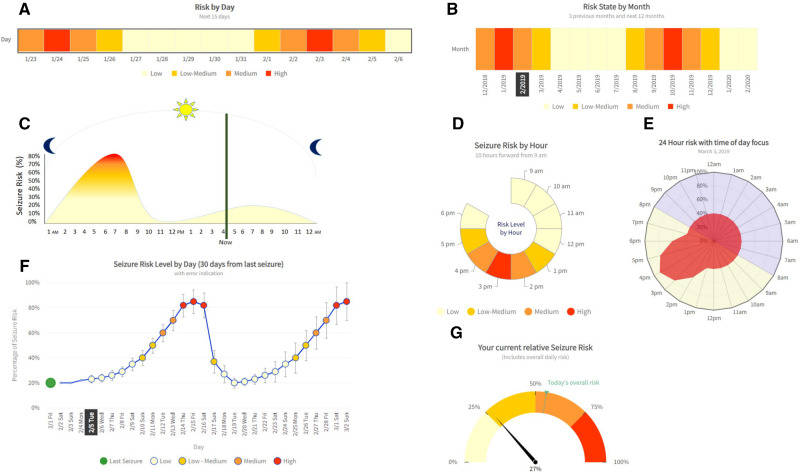
People with epilepsy and caregivers ranked hourly radar charts highest for protecting against errors in interpreting forecasts, reducing anxiety from seizure unpredictability, and understanding seizure patterns. Accuracy in interpreting visuals, such as a risk gauge, was dependent on seizure frequency. Visuals showing hourly/daily forecasts were more useful for patients who experienced seizure cycling than those who did not. Hourly line graphs and monthly heat maps were rated highest among clinicians for ease of understanding, anticipated integration into clinical practice, and the likelihood of clinical usage. Epilepsy providers indicated that daily heat maps, daily line graphs, and hourly line graphs were most useful for interpreting seizure diary patterns, assessing therapy impact, and counseling on seizure safety.
The choice of data visualization impacts the effective translation of seizure forecast algorithms into meaningful health outcomes.
This effort underlines the importance of incorporating standardized, quantitative methods for assessing the effectiveness of data visualization to translate seizure forecast algorithms into clinical practice.
癫痫发作预测算法已变得越来越准确,并且可能降低因发作不可预测性所导致的发病率和死亡率。要将这些益处转化为癫痫患者有意义的健康成果,需要对算法输出进行有效的数据可视化。迄今为止,尚无研究调查患者和医生对于通过健康信息技术将算法输出有效转化为数据可视化的看法。
作为癫痫发作预测可视化工具包的一部分,我们开发了前端数据可视化。我们对627名癫痫患者及其护理人员以及28名癫痫医疗服务提供者进行了调查。受访者根据功能、适用性和可用性等国际标准化软件质量标准对每个可视化进行评分。
癫痫患者及其护理人员将每小时雷达图在防止预测解读错误、减少发作不可预测性带来的焦虑以及理解发作模式方面评为最高。对诸如风险量表等视觉信息的解读准确性取决于发作频率。对于经历发作周期的患者,显示每小时/每日预测的视觉信息比未经历发作周期的患者更有用。每小时折线图和每月热力图在临床医生中在易于理解、预期整合到临床实践以及临床使用可能性方面的评分最高。癫痫医疗服务提供者表示,每日热力图、每日折线图和每小时折线图在解读发作日记模式、评估治疗效果以及就发作安全性提供咨询方面最有用。
数据可视化的选择会影响癫痫发作预测算法向有意义的健康成果的有效转化。
这项工作强调了纳入标准化定量方法以评估数据可视化有效性从而将癫痫发作预测算法转化为临床实践的重要性。