Bell B Sue, Hoskins Richard E, Pickle Linda Williams, Wartenberg Daniel
Division of Cancer Control and Population Sciences, National Cancer Institute, National Institutes of Health, USA.
Int J Health Geogr. 2006 Nov 8;5:49. doi: 10.1186/1476-072X-5-49.
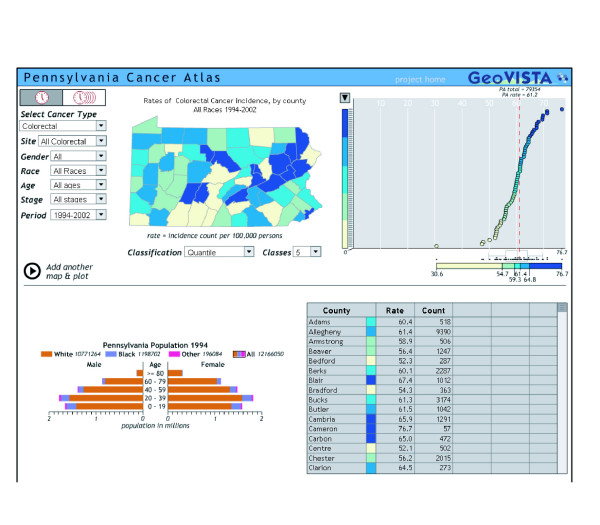
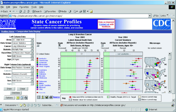
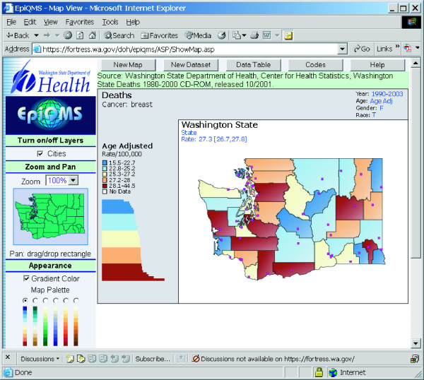
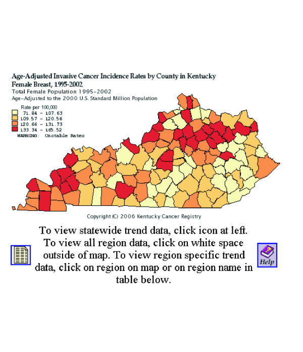
To communicate population-based cancer statistics, cancer researchers have a long tradition of presenting data in a spatial representation, or map. Historically, health data were presented in printed atlases in which the map producer selected the content and format. The availability of geographic information systems (GIS) with comprehensive mapping and spatial analysis capability for desktop and Internet mapping has greatly expanded the number of producers and consumers of health maps, including policymakers and the public.Because health maps, particularly ones that show elevated cancer rates, historically have raised public concerns, it is essential that these maps be designed to be accurate, clear, and interpretable for the broad range of users who may view them. This article focuses on designing maps to communicate effectively. It is based on years of research into the use of health maps for communicating among public health researchers.
The basics for designing maps that communicate effectively are similar to the basics for any mode of communication. Tasks include deciding on the purpose, knowing the audience and its characteristics, choosing a media suitable for both the purpose and the audience, and finally testing the map design to ensure that it suits the purpose with the intended audience, and communicates accurately and effectively. Special considerations for health maps include ensuring confidentiality and reflecting the uncertainty of small area statistics. Statistical maps need to be based on sound practices and principles developed by the statistical and cartographic communities.
The biggest challenge is to ensure that maps of health statistics inform without misinforming. Advances in the sciences of cartography, statistics, and visualization of spatial data are constantly expanding the toolkit available to mapmakers to meet this challenge. Asking potential users to answer questions or to talk about what they see is still the best way to evaluate the effectiveness of a specific map design.
为了传达基于人群的癌症统计数据,癌症研究人员长期以来一直有以空间表示形式(即地图)呈现数据的传统。历史上,健康数据是在印刷地图集中呈现的,地图制作者在其中选择内容和格式。具有用于桌面和互联网地图绘制的全面制图和空间分析能力的地理信息系统(GIS)的出现,极大地增加了健康地图的制作者和使用者数量,包括政策制定者和公众。由于健康地图,特别是那些显示癌症发病率升高的地图,历史上曾引发公众关注,因此这些地图的设计必须准确、清晰且易于广大可能查看它们的用户理解。本文重点关注设计能有效传达信息的地图。它基于多年来对健康地图在公共卫生研究人员之间交流用途的研究。
设计能有效传达信息的地图的基本要素与任何交流方式的基本要素相似。任务包括确定目的、了解受众及其特征、选择适合目的和受众的媒介,最后测试地图设计以确保它符合目的并能与目标受众有效准确地沟通。健康地图的特殊考虑因素包括确保保密性以及反映小区域统计数据的不确定性。统计地图需要基于统计和制图领域制定的合理实践和原则。
最大的挑战是确保健康统计地图能提供信息而不误导。制图学、统计学和空间数据可视化科学的进步不断扩展地图制作者可用的工具集以应对这一挑战。让潜在用户回答问题或谈论他们所看到的内容仍然是评估特定地图设计有效性的最佳方法。