Cho Ji Young, Suh Joori
Department of Housing and Interior Design, Kyung Hee University, Seoul, South Korea.
School of Architecture and Interior Design, University of Cincinnati, Cincinnati, OH, United States.
Front Psychol. 2020 Mar 31;11:296. doi: 10.3389/fpsyg.2020.00296. eCollection 2020.
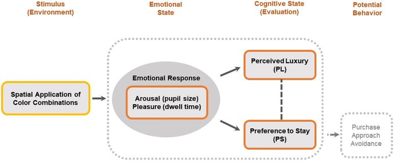
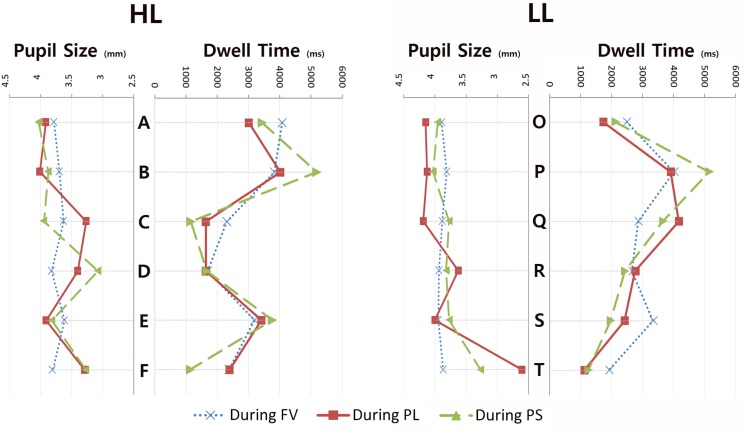
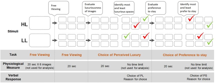
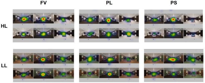
Color is a significant interior element with the power to influence emotions and behaviors in a particular environment. Numerous studies have investigated the impact of a single color on emotion; however, the collective emotional, cognitive, and behavioral effect created by combinations of colors applied to a space has not been thoroughly investigated. In this study involving both a survey as well as eye-tracking technology, we explored shaping the concept of spatial color efficacy by examining different applications of the same color combination in a space to determine whether they may cause different emotional responses, thereby impacting viewers' perception of luxury and intention to stay. A total of 26 interior design students at a university in Korea participated in the study. An environment simulating a hypothetical retail store was developed using a 3D rendering program, and six variations of spatial applications were created for each high luxury color combination and low luxury color combination to be used as stimuli. While viewing the images, participants were asked to identify which image looked most luxurious and in which space would they most want to stay. Results show the following: (a) the same color combination, if applied differently in a physical environment, can create different emotional responses, thereby affecting perceived luxury and preference to stay; (b) even a low luxury color combination can enhance perceived luxury and preference to stay depending on the spatial application; (c) gaze bias exists when selecting the most luxurious space and stating preference to stay as shown in the high correlation between dwell time and choice; in addition, differences in emotional response across images were also observed in the variations of pupil sizes measured during viewing various applications; (d) dark colors used in large amounts of surface were perceived as more luxurious than light colors when the same color combination was applied; and (e) appropriate contrast among colors was more influential in preference to stay than extreme or minimal contrast. Results expand the understanding of human behavior in relation to spatial color efficacy based on the spatial color combination and potential decision-making process in a retail setting.
色彩是一个重要的室内元素,能够在特定环境中影响人们的情绪和行为。众多研究探讨了单一颜色对情绪的影响;然而,应用于空间的颜色组合所产生的综合情绪、认知和行为效应尚未得到充分研究。在这项同时涉及调查和眼动追踪技术的研究中,我们通过考察同一颜色组合在空间中的不同应用方式,来探索空间色彩功效的概念,以确定它们是否会引发不同的情绪反应,进而影响观者对奢华感的认知以及停留意愿。韩国一所大学的26名室内设计专业学生参与了这项研究。使用3D渲染程序创建了一个模拟虚拟零售店的环境,并为每种高奢华度颜色组合和低奢华度颜色组合制作了六种空间应用变体作为刺激物。在观看图像时,参与者被要求指出哪张图像看起来最奢华,以及他们最想在哪个空间停留。结果表明:(a) 相同的颜色组合,如果在物理环境中的应用方式不同,会产生不同的情绪反应,从而影响对奢华感的认知和停留偏好;(b) 即使是低奢华度的颜色组合,根据空间应用的不同,也能提升对奢华感的认知和停留偏好;(c) 在选择最奢华的空间并表明停留偏好时存在注视偏差,如停留时间与选择之间的高度相关性所示;此外,在观看各种应用时测量的瞳孔大小变化中,也观察到了不同图像之间情绪反应的差异;(d) 当应用相同颜色组合时,大面积使用的深色比浅色被认为更奢华;(e) 颜色之间适当的对比度对停留偏好的影响比极端或最小对比度更大。这些结果拓展了我们对基于空间颜色组合的空间色彩功效以及零售环境中潜在决策过程相关人类行为的理解。