Morrison Cecily, Doherty Gavin
Engineering Design Centre, University of Cambridge, Cambridge, United Kingdom.
J Med Internet Res. 2014 Nov 13;16(11):e252. doi: 10.2196/jmir.3575.
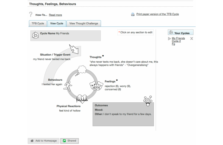
Engagement has emerged as a significant cross-cutting concern within the development of Web-based interventions. There have been calls to institute a more rigorous approach to the design of Web-based interventions, to increase both the quantity and quality of engagement. One approach would be to use log-data to better understand the process of engagement and patterns of use. However, an important challenge lies in organizing log-data for productive analysis.
Our aim was to conduct an initial exploration of the use of visualizations of log-data to enhance understanding of engagement with Web-based interventions.
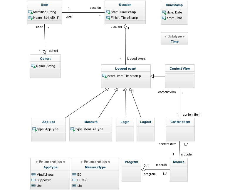
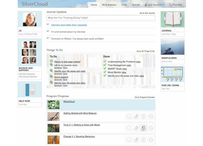
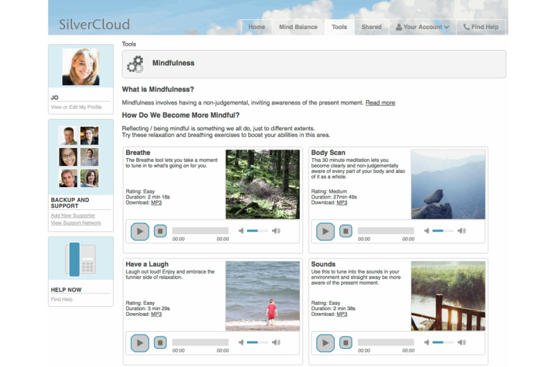
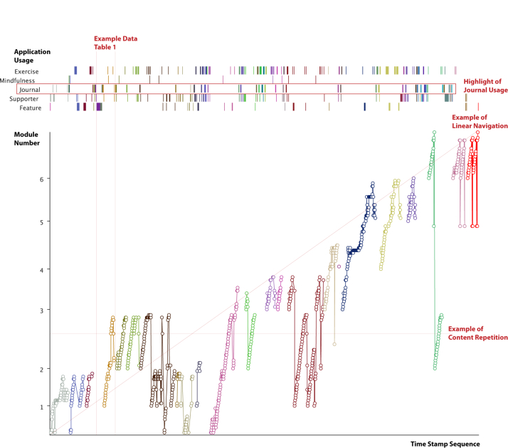
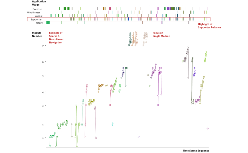
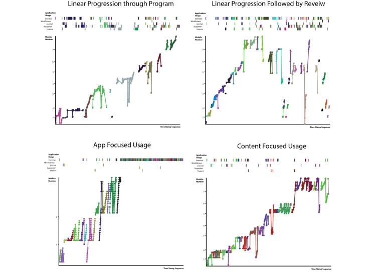
We applied exploratory sequential data analysis to highlight sequential aspects of the log data, such as time or module number, to provide insights into engagement. After applying a number of processing steps, a range of visualizations were generated from the log-data. We then examined the usefulness of these visualizations for understanding the engagement of individual users and the engagement of cohorts of users. The visualizations created are illustrated with two datasets drawn from studies using the SilverCloud Platform: (1) a small, detailed dataset with interviews (n=19) and (2) a large dataset (n=326) with 44,838 logged events.
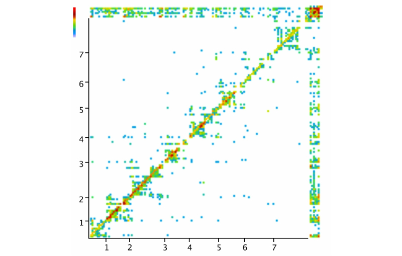
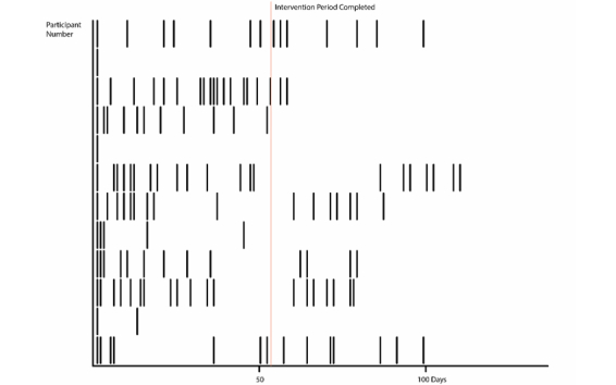
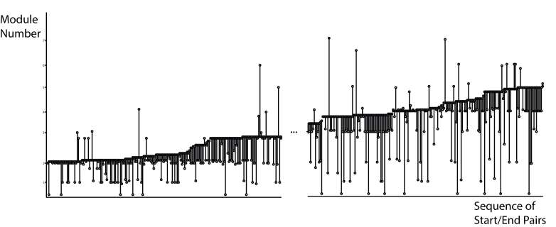
We present four exploratory visualizations of user engagement with a Web-based intervention, including Navigation Graph, Stripe Graph, Start-Finish Graph, and Next Action Heat Map. The first represents individual usage and the last three, specific aspects of cohort usage. We provide examples of each with a discussion of salient features.
Log-data analysis through data visualization is an alternative way of exploring user engagement with Web-based interventions, which can yield different insights than more commonly used summative measures. We describe how understanding the process of engagement through visualizations can support the development and evaluation of Web-based interventions. Specifically, we show how visualizations can (1) allow inspection of content or feature usage in a temporal relationship to the overall program at different levels of granularity, (2) detect different patterns of use to consider personalization in the design process, (3) detect usability issues, (4) enable exploratory analysis to support the design of statistical queries to summarize the data, (5) provide new opportunities for real-time evaluation, and (6) examine assumptions about interactivity that underlie many summative measures in this field.
参与度已成为基于网络的干预措施开发中一个重要的跨领域关注点。有人呼吁对基于网络的干预措施设计采用更严格的方法,以提高参与度的数量和质量。一种方法是使用日志数据来更好地理解参与过程和使用模式。然而,一个重要的挑战在于整理日志数据以进行有效的分析。
我们的目标是对使用日志数据可视化来增强对基于网络的干预措施参与度的理解进行初步探索。
我们应用探索性序列数据分析来突出日志数据的序列方面,如时间或模块编号,以深入了解参与度。在应用一系列处理步骤后,从日志数据中生成了一系列可视化。然后我们检查了这些可视化对于理解个体用户的参与度和用户群体的参与度的有用性。所创建的可视化通过使用SilverCloud平台的研究中的两个数据集进行说明:(1)一个带有访谈的小型详细数据集(n = 19)和(2)一个包含44,838条记录事件的大型数据集(n = 326)。
我们展示了四种对基于网络的干预措施的用户参与度的探索性可视化,包括导航图、条纹图、开始 - 结束图和下一步行动热力图。第一种表示个体使用情况,后三种表示群体使用的特定方面。我们为每种可视化提供了示例并讨论了显著特征。
通过数据可视化进行日志数据分析是探索用户对基于网络的干预措施参与度的一种替代方法,它可以产生与更常用的总结性测量不同的见解。我们描述了通过可视化理解参与过程如何支持基于网络的干预措施的开发和评估。具体而言,我们展示了可视化如何能够:(1)在不同粒度级别上以与整个程序的时间关系检查内容或功能的使用情况;(2)检测不同的使用模式以在设计过程中考虑个性化;(3)检测可用性问题;(4)进行探索性分析以支持统计查询的设计来总结数据;(5)为实时评估提供新机会;(6)检查该领域许多总结性测量所基于的关于交互性的假设。