Department of Oncology, Queens Cancer Research Institute, Queen's University Kingston, Kingston, ON, Canada.
Cancer Clinic of Southeastern Ontario, 25 King Street West, Kingston, ON, K7L 5P9, Canada.
Qual Life Res. 2018 Jan;27(1):75-90. doi: 10.1007/s11136-017-1710-6. Epub 2017 Nov 2.
Patient-reported outcome (PRO) results from clinical trials can inform clinical care, but PRO interpretation is challenging. We evaluated the interpretation accuracy and perceived clarity of various strategies for displaying clinical trial PRO findings.
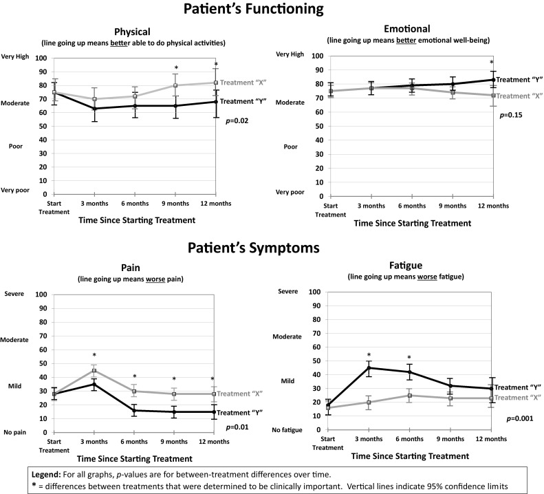
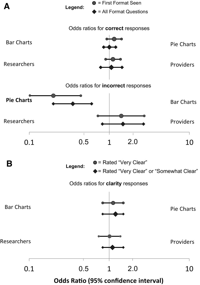
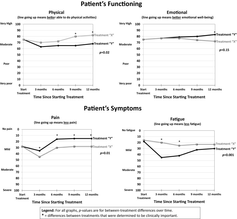
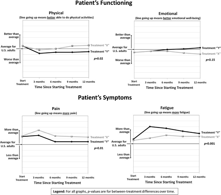
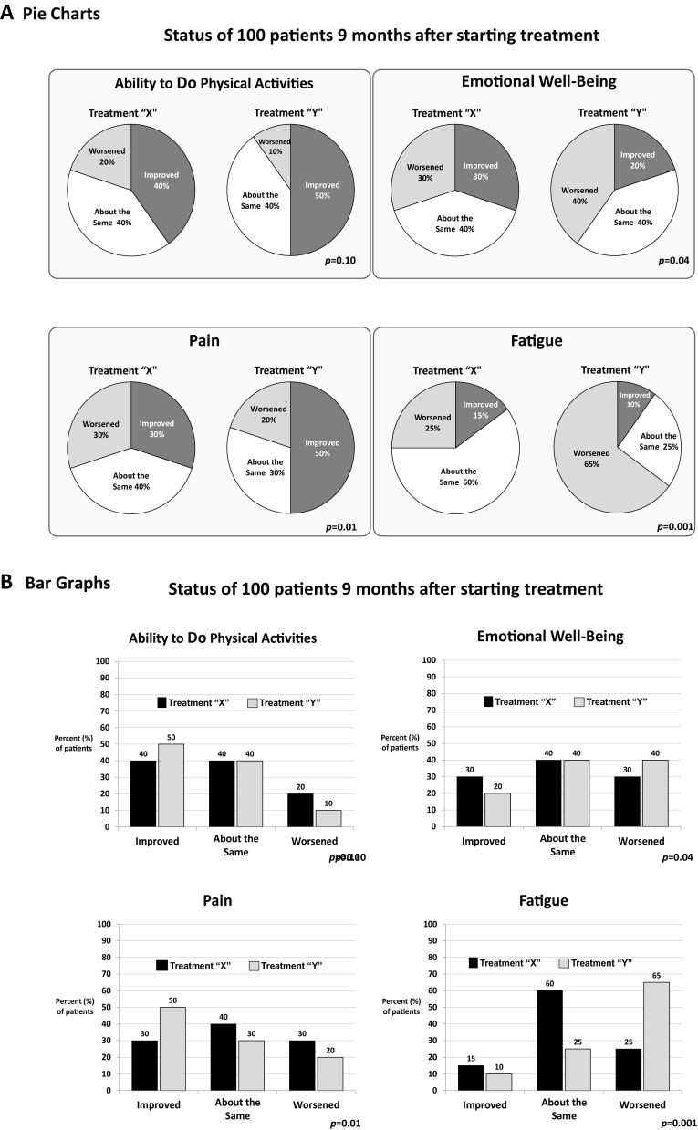
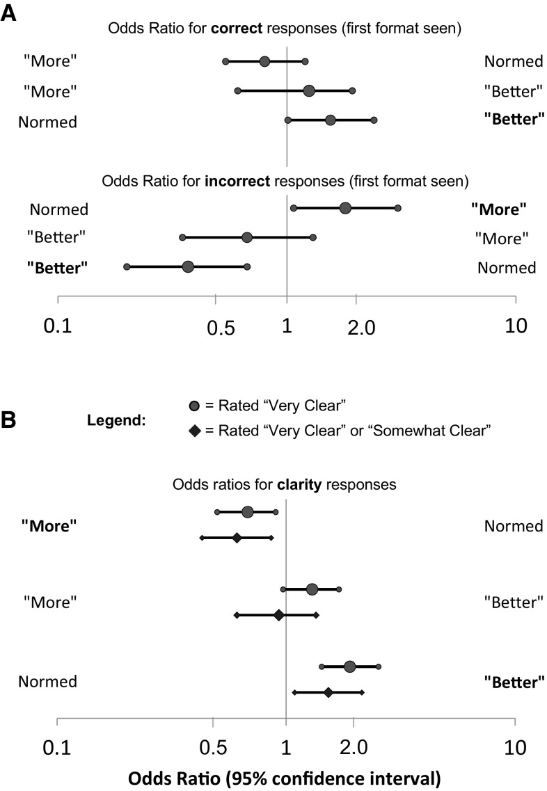
We conducted an e-survey of oncology clinicians and PRO researchers (supplemented by one-on-one clinician interviews) that randomized respondents to view one of the three line-graph formats (average scores over time for two treatments on four domains): (1) higher scores consistently indicating "better" patient status; (2) higher scores indicating "more" of what was being measured (better for function, worse for symptoms); or (3) normed scores. Two formats displayed proportions changed (pie/bar charts). Multivariate modeling was used to analyze interpretation accuracy and clarity ratings.
Two hundred and thirty-three clinicians and 248 researchers responded; ten clinicians were interviewed. Line graphs with "better" directionality were more likely to be interpreted accurately than "normed" line graphs (OR 1.55; 95% CI 1.01-2.38; p = 0.04). No significant differences were found between "better" and "more" formats. "Better" formatted graphs were also more likely to be rated "very clear" versus "normed" formatted graphs (OR 1.91; 95% CI 1.44-2.54; p < 0.001). For proportions changed, respondents were less likely to make an interpretation error with pie versus bar charts (OR 0.35; 95% CI 0.2-0.6; p < 0.001); clarity ratings did not differ between formats. Qualitative findings informed the interpretation of the survey findings.
Graphic formats for presenting PRO data differ in how accurately they are interpreted and how clear they are perceived to be. These findings will inform the development of best practices for optimally reporting PRO findings.
临床试验中的患者报告结局(PRO)结果可为临床治疗提供信息,但 PRO 结果的解读具有一定难度。我们评估了用于展示临床试验 PRO 结果的各种策略的解读准确性和感知清晰度。
我们对肿瘤学临床医生和 PRO 研究人员进行了一项电子调查(通过对临床医生的一对一访谈进行补充),随机分配受访者查看三种线图格式之一(两种治疗方法在四个领域的时间平均分数):(1)分数越高表示患者状况“越好”;(2)分数越高表示所测量的内容“更多”(功能更好,症状更差);或(3)标准化分数。两种格式显示了变化比例(饼图/柱状图)。使用多变量模型分析解读准确性和清晰度评分。
共有 233 名临床医生和 248 名研究人员做出了回应,10 名临床医生接受了访谈。与“标准化”线图相比,具有“更好”方向性的线图更有可能被准确解读(比值比 1.55;95%置信区间 1.01-2.38;p=0.04)。在“更好”和“更多”格式之间未发现显著差异。与“标准化”格式相比,“更好”格式的图表也更有可能被评为“非常清晰”(比值比 1.91;95%置信区间 1.44-2.54;p<0.001)。对于变化比例,与柱状图相比,受访者使用饼图进行解读时更不可能出错(比值比 0.35;95%置信区间 0.2-0.6;p<0.001);两种格式的清晰度评分没有差异。定性研究结果为调查结果的解读提供了信息。
呈现 PRO 数据的图形格式在解读的准确性和感知的清晰度方面存在差异。这些发现将为优化 PRO 结果报告的最佳实践提供信息。