Snyder Claire F, Smith Katherine C, Bantug Elissa T, Tolbert Elliott E, Blackford Amanda L, Brundage Michael D
Johns Hopkins School of Medicine, Baltimore, Maryland.
Johns Hopkins Bloomberg School of Public Health, Baltimore, Maryland.
Cancer. 2017 May 15;123(10):1848-1859. doi: 10.1002/cncr.30530. Epub 2017 Jan 13.
Patient-reported outcomes (PROs) (eg, symptoms, functioning) can inform patient management. However, patients and clinicians often have difficulty interpreting score meaning. The authors tested approaches for presenting PRO data to improve interpretability.
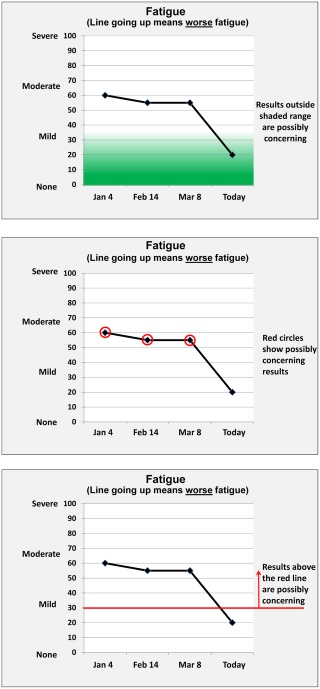
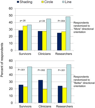
This mixed-methods study included an Internet survey of cancer patients/survivors, oncology clinicians, and PRO researchers circulated via snowball sampling, plus individual in-person interviews. Clinical importance was conveyed using 3 approaches (presented in random order): normal score range shaded green, concerning scores circled in red, and red threshold lines indicating normal versus concerning scores. Versions also tested 2 approaches to score directionality: higher = more (better for function, worse for symptoms) and higher = better for both function and symptoms. Qualitative data from online comments and in-person interviews supplemented quantitative results on interpretation accuracy, clarity, and the "most useful" format.
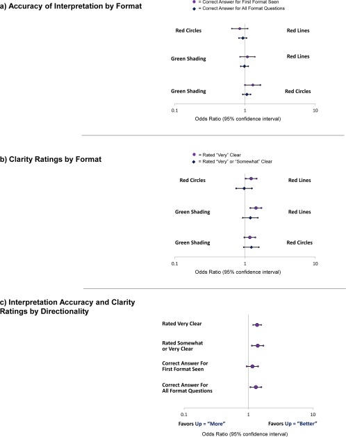
The survey included 1113 respondents: 627 survivors, 236 clinicians, and 250 researchers, plus 10 patients and 10 clinicians who were purposively sampled interviewees. Interpretation accuracy ranged from 53% to 100%. The formats in which higher = better were interpreted more accurately versus those in which higher = more (odds ratio [OR], 1.30; 95% confidence interval [CI], 1.07-1.58) and were more likely to be rated "very"/"somewhat" clear (OR, 1.39; 95% CI, 1.13-1.70) and "very" clear (OR, 1.36; 95% CI, 1.18-1.58). Red circle formats were interpreted more accurately than green-shaded formats when the first format presented (OR, 1.29; 95% CI, 1.00-1.65). Threshold-line formats were more likely to be rated "very" clear than green-shaded (OR, 1.43; 95% CI, 1.19-1.71) and red-circled (OR, 1.22, 95% CI, 1.02-1.46) formats. Threshold lines were most often selected as "most useful."
The current results support presenting PRO data with higher = better directionality and threshold lines indicating normal versus concerning scores. Cancer 2017;123:1848-1859. © 2017 The Authors. Cancer published byWiley Periodicals, Inc. on behalf of American Cancer Society. This is an open access article under the terms of the Creative Commons Attribution-NonCommercial-NoDerivs License, which permits use and distribution in any medium, provided the original work is properly cited, the use is non-commercial and no modifications or adaptations aremade.
患者报告的结果(PROs)(如症状、功能)可为患者管理提供信息。然而,患者和临床医生通常难以理解分数的含义。作者测试了呈现PRO数据以提高可解释性的方法。
这项混合方法研究包括一项通过滚雪球抽样方式对癌症患者/幸存者、肿瘤临床医生和PRO研究人员进行的互联网调查,以及个人面对面访谈。使用三种方法(以随机顺序呈现)传达临床重要性:正常分数范围用绿色阴影表示,有问题的分数用红色圆圈圈出,红色阈值线表示正常分数与有问题的分数。版本还测试了两种分数方向性的方法:更高 = 更多(功能更好、症状更差)以及更高 = 功能和症状两者都更好。来自在线评论和面对面访谈的定性数据补充了关于解释准确性、清晰度和“最有用”格式的定量结果。
该调查包括1113名受访者:627名幸存者、236名临床医生和250名研究人员,另外还有10名患者和10名临床医生作为有目的抽样的受访者。解释准确性范围为53%至100%。与更高 = 更多的格式相比,更高 = 更好的格式被解释得更准确(优势比[OR],1.30;95%置信区间[CI],1.07 - 1.58),并且更有可能被评为“非常”/“有点”清晰(OR,1.39;95% CI,1.13 - 1.70)以及“非常”清晰(OR,1.36;95% CI,1.18 - 1.58)。当呈现的第一种格式是红色圆圈格式时,其比绿色阴影格式被解释得更准确(OR,1.29;95% CI,1.00 - 1.65)。阈值线格式比绿色阴影格式(OR,1.43;95% CI,1.19 - 1.71)和红色圆圈格式(OR,1.22,95% CI,1.02 - 1.46)更有可能被评为“非常”清晰。阈值线最常被选为“最有用”。
当前结果支持以更高 = 更好的方向性呈现PRO数据,并使用阈值线表示正常分数与有问题的分数。《癌症》2017年;123:1848 - 1859。© 2017作者。由威利期刊公司代表美国癌症协会出版的《癌症》。这是一篇根据知识共享署名 - 非商业性 - 禁止演绎许可条款的开放获取文章,允许在任何媒介中使用和传播,前提是正确引用原始作品,使用是非商业性的且不进行修改或改编。