Centre for Earth Evolution and Dynamics (CEED), University of Oslo, Postbox 1028, Blindern, 0315, Oslo, Norway.
Department of Earth Sciences, Durham University, Durham, UK.
Nat Commun. 2020 Oct 28;11(1):5444. doi: 10.1038/s41467-020-19160-7.
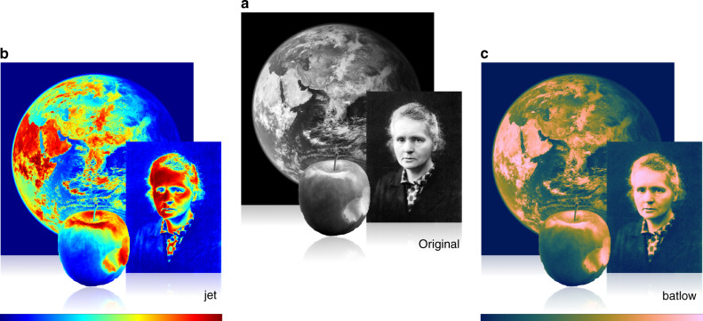
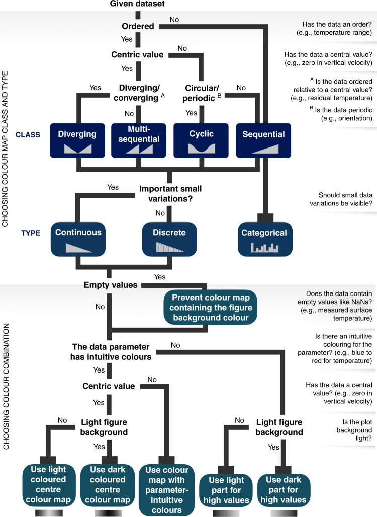
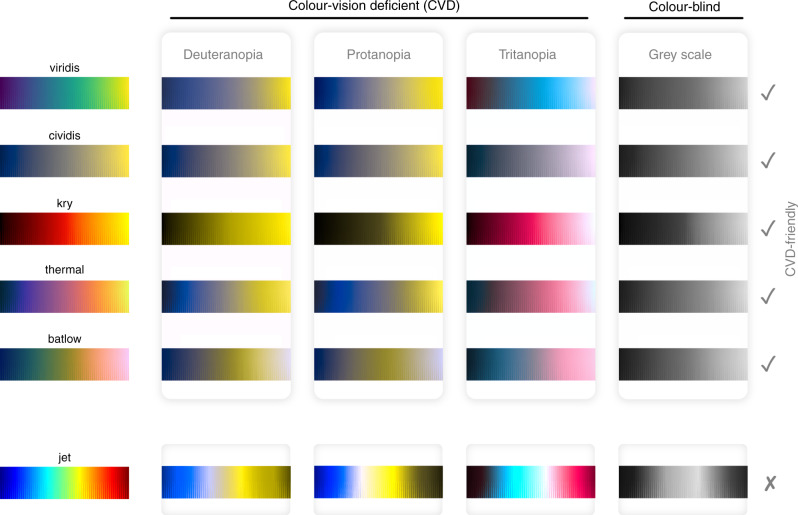
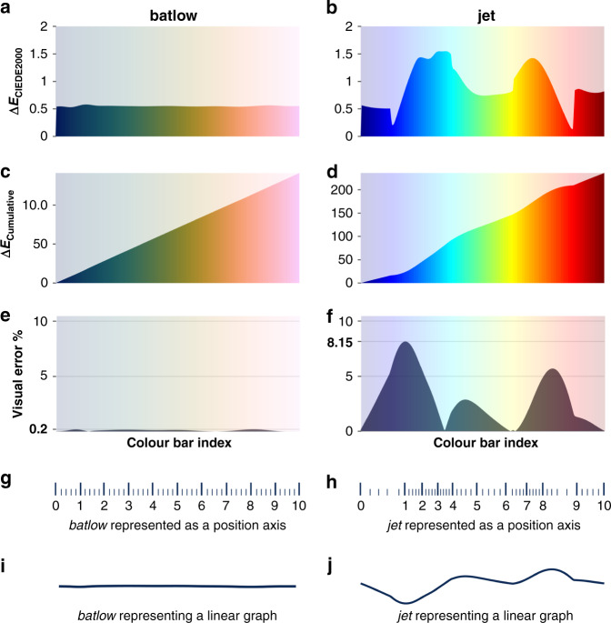
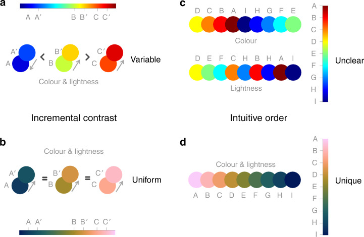
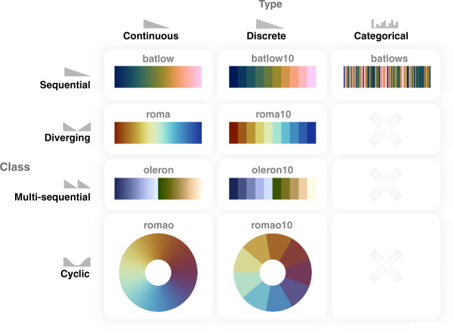
The accurate representation of data is essential in science communication. However, colour maps that visually distort data through uneven colour gradients or are unreadable to those with colour-vision deficiency remain prevalent in science. These include, but are not limited to, rainbow-like and red-green colour maps. Here, we present a simple guide for the scientific use of colour. We show how scientifically derived colour maps report true data variations, reduce complexity, and are accessible for people with colour-vision deficiencies. We highlight ways for the scientific community to identify and prevent the misuse of colour in science, and call for a proactive step away from colour misuse among the community, publishers, and the press.
数据的准确呈现对于科学传播至关重要。然而,在科学领域中,仍然存在着通过不均匀的颜色梯度来视觉扭曲数据或对色觉缺陷者难以辨认的彩色图谱,包括但不限于彩虹色和红绿色图谱。在这里,我们提供了一个简单的科学用色指南。我们展示了如何使用科学衍生的彩色图谱来报告真实的数据变化,减少复杂性,并使色觉缺陷者也能轻松获取信息。我们强调了科学界识别和防止科学中颜色滥用的方法,并呼吁科学界、出版商和媒体积极避免颜色滥用。